All Blogs
10 Best Resume Fonts for 2026: ATS Friendly & Professional
The 10 best resume fonts for 2026, ranked by ATS compatibility and recruiter readability - with exact sizes, pairings, and the fonts to avoid.
A recruiter spends 7.4 seconds to determine whether to analyze the resume completely or not, based on Ladders' study. Pairing the right font with a clean, ATS-friendly resume template keeps the entire document easy to read.
How much does it matter? A study by Nielsen Norman Group with 352 participants comparing 16 different fonts concluded that some fonts are more readable than others; however, there isn't one optimal font for everyone.
So this guide helps you filter the best fonts by industry, the exact sizes, the fonts to avoid, and the one ATS "rule" worth noting.
TL;DR
The best 10 resume fonts for 2026 are Times New Roman, Arial, Calibri, Roboto, Helvetica, Verdana, Cambria, Garamond, Avenir Next, Aptos, and Georgia; serif fonts should be preferred in traditional fields, while sans-serif fonts should be preferred in modern fields. The best resume font is the one that the recruiter notices. Calibri or Arial, both look professional and parse cleanly in every major ATS. Keep the size of your body text between 10-12 pt and headings at 14-16 pt.
Best Resume Fonts for 2026: Quick Comparison
Font | Style | Best For |
Times New Roman | Serif | Finance, law, academia |
Arial | Sans-serif | Any role (safest pick) |
Calibri | Sans-serif | Corporate, healthcare, general use |
Roboto | Sans-serif | Tech, startups, digital roles |
Helvetica | Sans-serif | Design, marketing, tech |
Verdana | Sans-serif | On-screen, content-heavy resumes |
Cambria | Serif | Engineering, science, management |
Garamond | Serif | Law, publishing, executive |
Avenir Next | Sans-serif | Creative, design-adjacent roles |
Georgia | Serif | Traditional roles |
Does Your Resume Font Really Matter?
Yes. Your resume font has to pass two tests: the ATS needs to read it clearly, and attract the recruiter's eyes. Standard fonts pass both tests, but decorative fonts like Comic Sans or Papyrus fail at least one.
Readability and Professionalism
This is a recruiter's test. In seconds, recruiters scan every resume they receive, and a clear, recognizable font allows them to easily locate the information they need about you without having to struggle.
A distracting or hard-to-read font may confuse the recruiters, and they might not even look at your achievements. It gives them a wrong first impression of you.
Impact on Applicant Tracking Systems (ATS)
This is the software's test. According to Indeed, an ATS parses your resume to extract its data before a recruiter sees it.
The best fonts for conversion include such as Arial, Calibri, Helvetica, Georgia, and Times New Roman, which will convert perfectly, whereas other decorative fonts may have problems converting, which may affect your chances before you are even considered.
You can confirm how your own draft parses by running it through a resume checker.
What Are the 10 Best Resume Fonts in 2026?
The choice of fonts is crucial for an astounding resume. The selected font should significantly influence the recruiter. These are some of the best fonts that are compatible with ATS and visually appealing to humans.
1. Times New Roman
Times New Roman is a classic serif typeface known for its legibility, and those little tails at the end give it a touch of elegance, making it an excellent choice for resumes and all other professional works. Anything written using this font is sure to create a place in the recruiter's mind.
Best for: finance, law, and academia, where a formal, conservative look is expected.
2.Arial
Arial is a sans-serif typeface. It's best to use it in a resume; most of us use it in body text and headers. Known for its clean and clear text, it is a professional font that is ATS-friendly.
Best for: any role; the safest all-purpose choice.
3. Calibri
It is a modern typeface used in various industries, is known for its easy-to-read context, and is clean and professional. Better to prefer this if you find it more difficult to select.
Its lighter text makes it fit more words on a page. One thing is that it lacks uniqueness, everyone is using; as its default font, Microsoft Word.
Best for: corporate, healthcare, and general use.
4. Roboto
Roboto is a sans-serif typeface. Best when you want to catch the recruiter's eye, and it can be used for names and titles. It has a geometrical charm that makes it the perfect font for resumes, as it can blend in many ways.
Best for: tech, startups, and digital-first roles.
5. Helvetica
Helvetica is a sans-serif typeface. An excellent choice for resumes, its clean design makes it more legible for recruiters who will not be confused when recruiting you. Its spacing and the letters give a touch of professionalism and make your resume look clean and organized.
Best for: design, marketing, and tech.
6. Verdana
Verdana is a sans-serif typeface. With no little tails, it makes the resume look clean and legible as well as professional. An ATS-friendly font that will do the job perfectly.
Best for: content-heavy resumes read primarily on screen.
7. Cambria
Cambria is a transitional serif typeface. The spacing, light weights, and good proportions of letters make it a resume-appealing one. It was a specially designed font for computer users.
Best for: engineering, science, and management roles.
8. Garamond
Garamond is a family of serif fonts. It is also one of the best fonts used in resumes, but comparatively low. It has the best letters and good spacing, but most of these look great on paper rather than on a computer. But it is a versatile font that is widely accepted in many industries.
Best for: law, publishing, and executive resumes.
9. Avenir Next
Avenir is a geometric sans-serif typeface that is also better for crafting a resume because of its clean and crisp textures. It delivers a straightforward message to the Hiring Manager about your job and your qualifications.
Best for: creative and design-adjacent roles that want polish without flair.
10. Georgia
Georgia is a serif typeface, known for its versatility and readability, and is also one of the best fonts used for writing a resume, document, and professional letters.
Best for: roles that want tradition plus a bit of warmth.
How Do You Choose the Right Resume Font?
Choose a clear, readable, and ATS-friendly font; ensure that the body is at 10-12 pt while the heading is at 14-16 pt, and use this format throughout the document. The perfect font for a resume is the one that a recruiter will never notice consciously because it does not draw attention to itself. Here are six ways to select the ideal font:
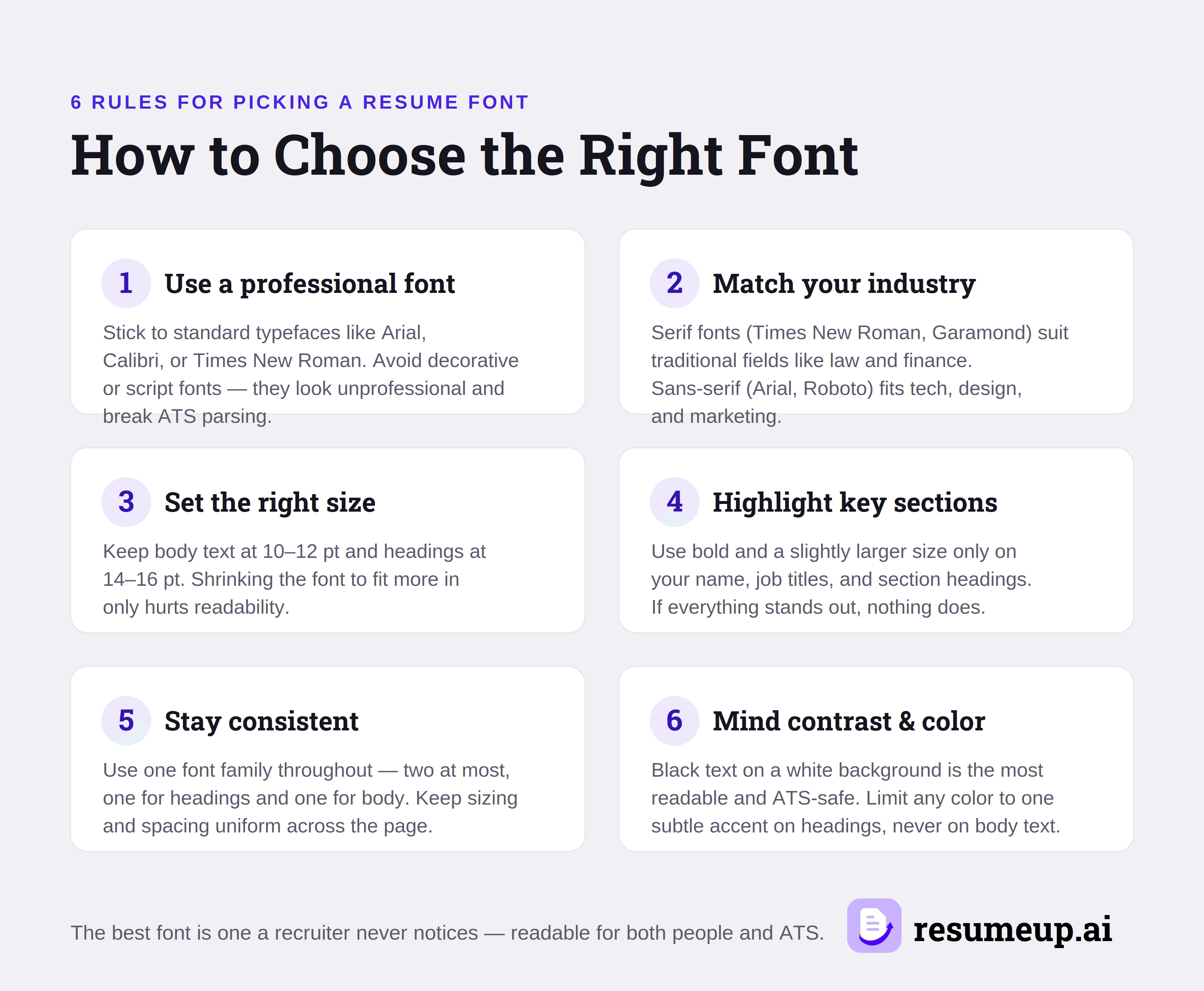
1. Use professional wording
Stick to universally accepted fonts like Arial, Calibri, Helvetica, Georgia, or Times New Roman. Do not use decorative or script fonts, e.g., Comic Sans, Papyrus, and Brush Script, as they will look unprofessional and will not pass ATS filtering.
2. Choose a font that fits your industry
If you are in traditional sectors, such as law, finance, or academia, choose serif fonts such as Times New Roman, Cambria, Garamond, and Georgia. For the modern sectors, including tech, design, and marketing, go with sans-serif fonts, such as Arial, Calibri, Helvetica, and Roboto.
3. Select the right font size
Make sure body fonts are between 10 and 12 pt, while heading fonts should be from 14 to 16 pt. Smaller fonts don’t contribute anything but decrease the readability of your resume.
4. Highlight the right sections
Use bold and a bit bigger font size for your name, job titles, and section headings only. You cannot emphasize everything, so it’s important to be consistent and keep the font format constant throughout the resume.
5. Be consistent
Use one typeface in your resume, preferably no more than two at a time – one for headings and one for other text elements. The font sizes must remain the same throughout.
6. Use the right contrast and colors
Using black text on a white background increases legibility and ensures ATS compatibility better than any other color can. Adding color to your document is okay, provided you use only one subtle accent in your heading.
Most importantly, select a font that will be easy to read by both the human recruiter and the ATS - this rule alone eliminates most font options. If you're unsure about which font actually works on your resume, a ready-made professional resume template pairs an appropriate typeface with the layout for you.
Which Resume Fonts Should You Avoid?
Avoid using decorative, script, monospaced, and compressed fonts on a resume, as they make it less readable and are usually not parsed by ATS. The fonts that need to be avoided are Comic Sans, Papyrus, Brush Script, Courier, Impact, Lucida Console, Futura, Bodoni, and Haettenschweiler. Here's the detailed reason why it fails:
1. Unprofessional and decorative fonts
Comic Sans, Papyrus, and Brush Script give a casual impression; they ignore you, even when you have impressive experience. They are seen by recruiters as having a lack of professional judgment.
2. Hard-to-read and distorted fonts.
Impact and Haettenschweiler are too bold and condensed to use as body text, while Bodoni’s high contrast between thin and thick strokes will put a strain on the eye in small print. Hard-to-scan fonts force recruiters to scan over your accomplishments.
3. Monospaced and dated fonts
Courier and Lucida Console evenly space each letter, wasting space in the process and giving your resume a very old-fashioned feel. Though Futura is modern and simple, its geometric design seems more suited for a brand identity than a professional document.
So if the font gets more attention than your work experience and achievements, don't include it.
Conclusion
The font used will not necessarily be the deciding factor that makes you get a job, but choosing the wrong font will work against you, and you can't show the recruiter what you can do. That's why the goal is not finding a “perfect” font; you need something that will prevent people from ignoring the reading.
Choose the safe option because a resume needs to convey clarity, not personality. Stick to a simple font style, keep consistency in using one font style throughout the resume, and use an AI resume builder to ensure everything is done right automatically.
Frequently asked questions
Is Times New Roman or Arial better for a resume?
Can I use two fonts on my resume?
Is Calibri a good resume font?
Does resume font affect ATS?

Rohith Reddy
Co-Founder
Rohith co-founded ResumeUp.AI after a decade building software and hiring engineers. He graduated from IIIT in Computer Science, then worked at ADP, YuppTV, and Paperguide — leading teams and conducting 500+ technical interviews as a hiring manager. He writes from both sides of the table: what recruiters actually look for, and what the candidate side of the resume actually feels like.